A box plot provides a simple graphical summary of data. These plots originate from the work of Tukey (1977).
Definitions
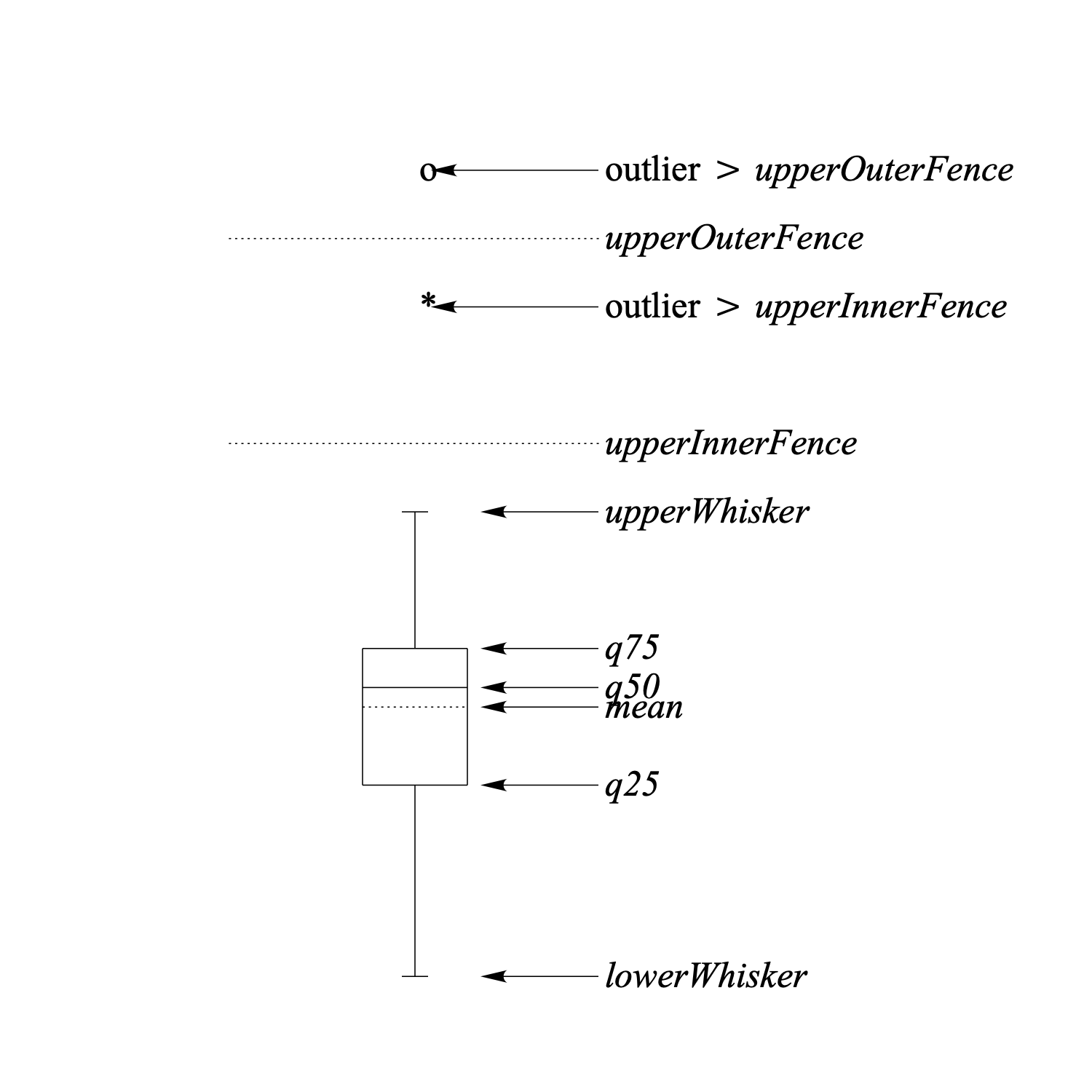
The following figure shows an annotated box plot.
To understand the box plot we need the following definitions:
- q25 = lower quartile, 25% of the data lie below this value
- q50 = median, 50% of the data lie below this value
- q75 = upper quartile, 25% of the data lie above this value
The following definitions all depend on these quantiles:
- hspread = |q75 – q25| (50% interval)
- lowerOuterFence = q25 – 3.0 * hspread (not in figure)
- lowerInnerFence = q25 – 1.5 * hspread (not in figure)
- upperInnerFence = q75 + 1.5 * hspread
- upperOuterFence = q75 + 3.0 * hspread
- lowerWhisker = smallest data value larger than lowerInnerFence
- upperWhisker = largest data value smaller than upperInnerFence
The box plot is a summary of the data in which:
- • the horizontal lines of the rectangle correspond to q25, q50 and q75, respectively.
- • the dotted line corresponds to the mean.
- • the outliers outside the outerFences are drawn with an 'o'.
- • the outliers in the intervals (lowerOuterFence, lowerInnerFence) and (upperInnerFence, upperOuterFence) are drawn with an '*'.
- • the whisker lines outside the rectangle connect q25 with lowerWhisker, and, q75 with upperWhisker, respectively. With no outliers present, the whiskers mark minimum and/or maximum of the data.
Links to this page
© djmw 20111010