|
Draws a bar plot from data in one or more columns of the selected Table. In a bar plot the horizontal axis has nominal values (labels).
Keating & Esposito (2006) present a bar plot in their fig. 3 from which we estimate the following data table
Language Modal Breathy
Chong -1.5 5
Fuzhou 2 10
Green Hmong 3 12
White Hmong 2 11
Mon -1.5 0
SADV Zapotec -6 -4
SLQ Zapotec 3.5 14
Tlacolula Zapotec 3 13
Tamang 1 1
!Xoo 1 14
Given that we have these data in a Table with the three columns labeled "Language", "Modal" and "Breathy", respectively, we can first try to reproduce their figure 3 (a bar plot with both Modal and Breathy columns displayed)
As you can see the labels in the first column are very long texts and they will surely overlap if plotted at the bottom of a plot. We therefore use a value of 15 degrees for the "Label text angle" parameter. This will make the label texts nonoverlapping. We cannot make this angle much larger, because then the label texts would run out of the viewport.
The following script line will produce the picture below.
Bar plot: "Modal Breathy", -10, 20, "Language", 1.0, 1.0, 0.0, "0.9 0.5", 15.0, "yes"
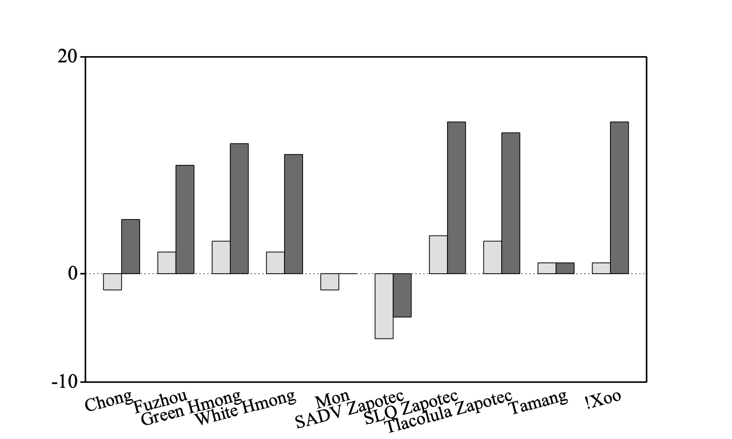
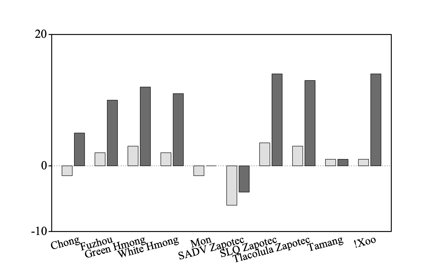
The essentials of the bart plot in their paper are perfectly reproduced in the figure above. If you want the bars within a group to be placed somewhat more apart, say 0.2 times the bar width, you can set the "Distance between bars in a group" to a value of 0.2:
Bar plot: "Modal Breathy", -10, 20, "Language", 1.0, 1.0, 0.2, "0.9 0.5", 15.0, "yes"
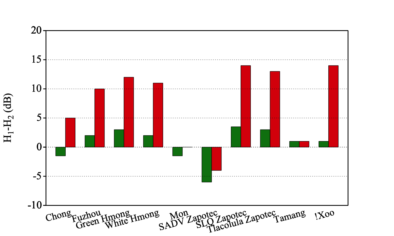
Of course we can also work with colours and we can add vertical marks as the following scriptlet shows
Bar plot: "Modal Breathy", -10, 20, "Language", 1.0, 1.0, 0.0, "Green Red", 15.0, "yes"
Marks left every: 1, 5, 1, 1, 1
Text left: 1, "H__1_-H__2_ (dB)"
© djmw 20230901